

Choose a throw blanket color by starting with the largest colors already in your room, then decide whether the throw should blend in or add contrast. Repeat an existing accent for a coordinated look, or choose a lighter or darker shade than the sofa so the blanket remains visible. Check the color in the room’s daylight and evening light before deciding.
- To choose a throw blanket color, start with the sofa, walls and rug, then decide between a close match and contrast.
- Repeat a color already present in a pillow, rug or artwork if you want the throw to feel connected to the room.
- Betterhouse’s Argyle Reversible Throw Blanket suits shoppers who want a reversible option, but its listed colors still need checking against the room.
- View the throw beside your largest furnishings in both daylight and evening light before making the final choice.
How do you choose a throw blanket color for your room?
Use the furniture and finishes you already have as your color guide. A throw covers less area than a sofa or bedspread, but its position makes it noticeable. You can use it to connect colors that already appear in the room or to introduce a deliberate contrast.
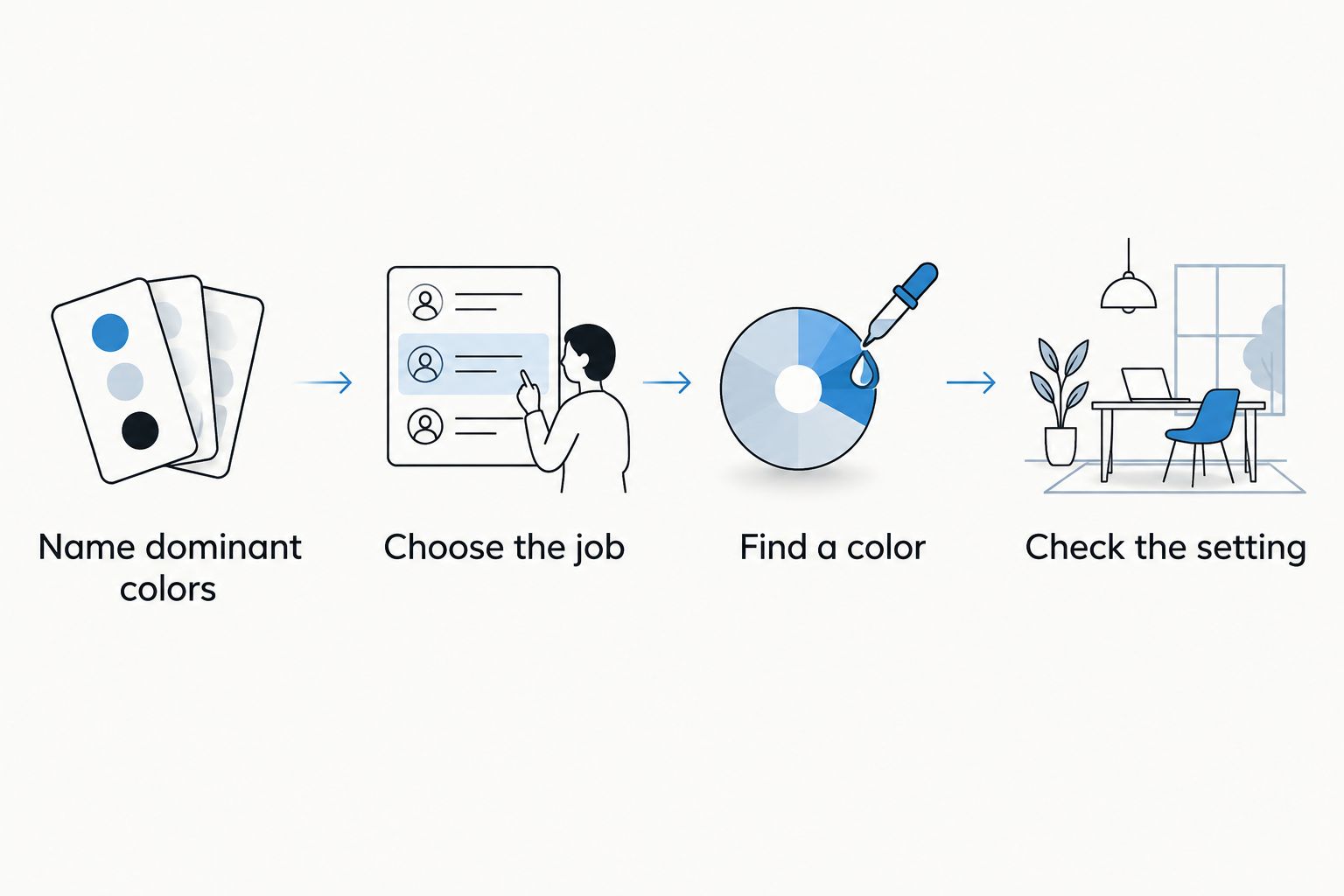
- Name the room’s dominant colors. Look at the sofa or bed, walls, rug and curtains. Write down the colors you see rather than the colors you planned to use; the room in front of you is the one the throw needs to suit.
- Choose the throw’s job. Pick a nearby shade if you want the blanket to sit quietly with the furniture. Pick a contrasting shade if you want it to stand out when draped over an arm or folded at the foot of a bed.
- Find a color to repeat. A pillow, rug detail or piece of artwork gives you a starting point. If the throw will sit on a sofa, compare it with the pillows you use there; this guide to styling decorative pillows helps you consider the grouping as a whole.
- Check the actual setting. Put a fabric sample or the blanket itself near the furniture. Look at it during the day and with the lamps you normally use at night. A color that works on a shopping screen still needs to work in your room.
The order matters: decide whether you want the throw to blend in or stand out before choosing a particular color. Otherwise, you can find a shade you like and still dislike how it looks on the sofa.
Why this matters
A throw is easy to move, so its color can change how you see a sofa, chair or bed without changing the furniture. That flexibility makes it tempting to choose from an isolated product photo. In 2026, the more useful question is how the color looks against the surfaces that will surround it every day.
A throw that repeats a small existing accent connects the room; a throw that contrasts with the furniture becomes an accent itself. Neither choice is automatically better. Decide which effect you want, then judge candidate colors against that goal.
Color is only part of the decision. Pattern, texture, the amount of blanket you leave visible and the light in the room all affect the result. You do not need a perfect match; you need a color relationship you like when the throw is in its usual spot.
Should your throw match the sofa or contrast with it?
Match the sofa when you want the throw to read as another layer of the same furnishing. Contrast with it when you want the blanket’s fold, edge or drape to show clearly. If an exact match looks flat to you, try a lighter or darker shade from the same color family instead.
| Approach | Best for | What works | Trade-off |
|---|---|---|---|
| Close match | A quiet, continuous look | Keeps attention on the room’s other colors | The throw can visually disappear against the sofa |
| Lighter or darker shade | A subtle layer you can still see | Separates the blanket from the upholstery without changing the palette | A slight shade difference can look accidental if you wanted an exact match |
| Repeated accent color | Connecting the sofa to a rug, pillow or artwork | Gives the throw a clear reason to be in the room | Too much of the accent can make it less distinctive |
| Contrasting color | Making the throw a visible accent | Draws attention to the place you drape it | The contrast can compete with other strong colors |
Best for a restrained living room: choose a close match or a lighter or darker shade. Best for a room that needs a visible accent: repeat a color from something already on display. These are design choices, not rules you have to follow; judge them by how the whole room looks from where you usually enter it.
For a neutral sofa, which route is easier?
Both routes work. A neutral sofa gives you room to choose another neutral for a soft transition or a stronger color that draws the eye. Before adding a new accent, check whether the rug, pillows or artwork already offer one you can repeat. That keeps the throw from becoming the only place that color appears.
For a colorful sofa, should you add another strong color?
Start with a shade already in the sofa or elsewhere nearby. A second strong color is a deliberate choice, not a required finishing touch. If the room already has several noticeable colors, a quieter throw lets you keep the focus on the furniture and accessories you own.
How do pattern and texture change the color choice?
A patterned throw can connect several room colors, but check the color you see from a distance. When the blanket is folded on a chair or sofa, only part of the pattern shows. Make your decision using the visible section rather than assuming the full pattern will always be on display.
Texture changes the impression, too. A smooth-looking surface and a raised weave can make similar colors feel different alongside upholstery. Compare the throw with the sofa or bedding in person when you can, especially if the fabrics will touch or overlap.
For a room with a patterned rug or busy pillows, start with a throw that repeats one color you already see. For a room with mostly plain surfaces, a patterned throw gives you another way to introduce detail without choosing a new large furnishing. Neither approach guarantees a match; the surrounding pieces decide whether it works.
Betterhouse is best for shoppers who want to compare a throw’s listed material, dimensions and care instructions as well as its color. Its Argyle Reversible Throw Blanket is listed as 50 x 60 inches and 100% polyester microfiber, with cold machine washing and flat drying in the product description. Its reversible design offers a choice of visible sides, but the listing details supplied here do not establish how either side will look beside your furniture. Check the product images against your room before treating it as a color match.
If you want to try a patterned option, look at where the blanket will usually rest. A throw folded over a sofa arm shows a different portion of its pattern from one spread across a seat. Place matters more than an abstract idea of what the pattern should look like.
Why throw blanket colors look different in a room
Color decisions vary because the throw is seen beside other surfaces, under changing light and in different positions. Check these factors before you settle on a shade:
- Sofa or bedding color: The surface directly behind the throw provides the strongest immediate comparison.
- Rug and curtains: These larger areas influence whether the throw looks connected to the rest of the room.
- Existing accents: Pillows and artwork give you colors to repeat without introducing an unrelated one.
- Daylight and lamps: Check the color at the times you actually use the room, not only in a product image.
- Visible area: A neatly folded throw shows less color and pattern than one spread across a seat or bed.
- Texture and pattern: The portion you can see affects which color stands out.
In 2026, use a photo of your own room as a comparison aid while browsing, then confirm the choice beside the furniture if possible. A photo helps you remember the palette; it does not replace looking at the fabrics together in the room.
How do you choose a throw color for a living room?
Start with the sofa, then look at the rug and the pillows that stay in the room. If those pieces already share an accent color, a throw in that family can connect them. If the sofa is the clear focal point, decide whether the throw should sit quietly against it or mark the spot where you want color.
Think about where the blanket will live when nobody is using it. Across the back of a sofa, it occupies a larger visible area. Folded into a basket, it contributes much less to the room’s everyday palette. Choose for its usual position, not just the way it looks when fully spread out.
You can also compare inspiration images with your actual furniture before shopping. The useful part of a reference photo is the relationship between colors, not a promise that the same shade will work in every room. This living room decor shopping guide offers another way to turn what you like in a photo into decisions for your own space.
How do you choose a throw color for a bedroom?
Compare the throw with the bedding you leave visible and the color at the head of the bed. A close shade gives the bed a calmer, layered look. A contrasting shade makes the foot of the bed more noticeable, particularly when the throw stays folded there during the day.
If your bedding has a print, pick a color already present in it and compare the two side by side. If the bedding is plain, decide whether you want the throw to add color, pattern or just another texture. You do not have to ask one blanket to do all three jobs.
In a small bedroom, look at the bed from the doorway before deciding. That view tells you how much of the throw people will actually see and whether its color draws attention to the bed or blends into it. The right answer is the one that supports the room you want to look at each day.
What if you are choosing a throw color online?
Keep your room’s colors beside you while you browse: a photo helps, and a fabric sample is better when you have one. Compare the product images with the sofa, rug or bedding the throw will touch. Read the listed dimensions, material and care information separately from the color description; those details answer different questions.
Do not rely on a color name alone. Look at every supplied product image, including photos that show the blanket folded or draped, and check which part of a pattern is visible. If the listing does not make the color clear enough for your decision, do not fill the gap with an assumption.
The Betterhouse brand states a 30-day return policy. That gives you a stated return window, not a substitute for checking a product’s current listing and the full policy before ordering. For color, the deciding test remains how the throw looks beside your own furnishings.
What throw color works if you change your decor often?
Choose a color you can already use with several pieces you intend to keep, rather than matching one temporary accent exactly. A shade drawn from the sofa or rug has a clear place in the current room. A reversible throw is another option if you want to change which side is visible, but check both sides rather than assuming each suits a different palette.
For 2026, make the decision around the room’s stable furnishings first. Pillows and small accessories are easier to move around, while a throw that only matches a single seasonal piece gives you fewer ways to use it with the rest of the room.
FAQ
How do I choose a throw blanket color for my room?
Start with the sofa or bed, then choose whether the throw should blend in or add contrast. Compare your choice with the rug, pillows and room lighting before deciding.
Should a throw blanket match my couch?
A throw can match your couch for a quiet look, but it does not have to. A lighter or darker shade makes the blanket visible without introducing a different color family.
What throw color works with a neutral sofa?
Choose another neutral for a restrained look or repeat an accent color from your rug, pillows or artwork. Check the shade beside the sofa rather than judging it alone.
Can I use a patterned throw with patterned pillows?
Yes, if you like how the patterns look together in the room. Repeating a color shared with the pillows gives you a practical starting point; check the folded throw because only part of its pattern will show.
How can I tell whether a throw color will work when shopping online?
Compare every available product image with a photo or sample of your furniture, then check the throw in your room if you order it. A color name alone cannot show you how it will look beside your sofa or bedding.
Should I choose a different throw color for a bedroom?
Choose the bedroom throw against the bedding and the view from the doorway, not against the living room palette. A close shade layers quietly; a contrasting shade draws attention to the bed.
One last thing
Before you commit to a color in 2026, put your candidate beside the furnishing it will touch and step back. The best test is not whether you like the color on its own; it is whether you still like it when the throw is folded, partly hidden and surrounded by the room you actually use.